In 2023, everything feels like an over-thought, over-engineered framework even for the simplest of concepts.
I like to keep things simple-as they should be. Concepts like Prioritization shouldn’t be something that only Product management or Leadership own, it needs to be democratized. So here’s a rather tried and tested approach that can be tried out. I have made concerted efforts to keep this as simple as possible and distill some of the ideas from design thinking.
As a cautionary tale – this framework came about and is best applied in situations like workshops, but I’m sure creative folk can adapt it to other pieces of work too!
Three Dimensions
In this model, I have considered three dimensions that prioiritsation is most commonly done according to. They are
- Value to the User
- Cost & effort
- Business Value
The basic principle of this approach is to rank each of your decisions across the dimensions, in order to ease your decision-making. In a workshop setting, I like to break the teams into sub-teams and have them perform the ranking activity accroding to their expertise. This will be explained below:
1. Value to the user
As PM over-indexed in User Research & Discovery methods, this one is my favourite but depending of a teams level of research maturity, this can be the most difficult to grasp too. A bad decision here has the MOST impact on the overall outcomes.
Okay, cut to the chase. Set your user-specialists (researchers or designers or salespeople) on a bid to rank each of the solutions on a scale of 1 to n. They must deliberate and discuss and have sound logic for this ranking. They dont necessarily have to give unique ranks – if it’s hard to decide, saying these 2 are equally important is fine too!
2. Cost and Effort
Now get your builders (typically engineers or data scientists) to do the same activity as described above for how much time and effort it will take to build out each of the options. Understand, when we’re saying cost we don’t need to go into a P/L statement. This is a measure of what’s the easiest to build vs what’s the hardest.
Must keep in mind any dependencies here too.
3. Value to the Business
This is the place your leadership and business folk shine, ocassionally PMs might have to jump in here, but it’s best to have your leadership or site merchandisers estimate the market size for each of the options. For extremely convoluted spaces this can be simplified into a Max, Mid, Min categorisation for speed.
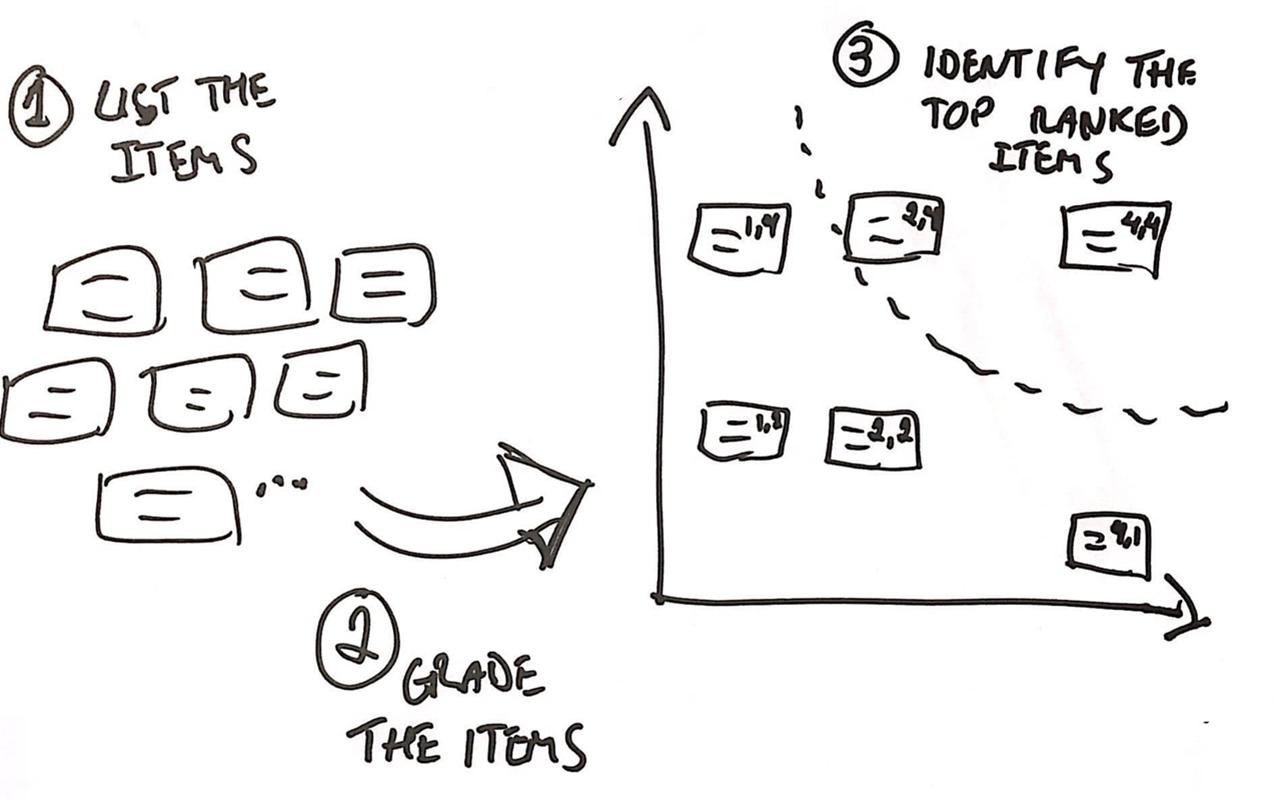
Bringing it all together!
Time to visualize folks!
Start off with a a simple graph – User Value on the X axis, Time and effort on the Y axis. Now you have a nice visualisation of what option can generate disproportionate amount of value for the users!
But what about Business? Easy, overlay the points as bubble charts mapped to their projected impact!
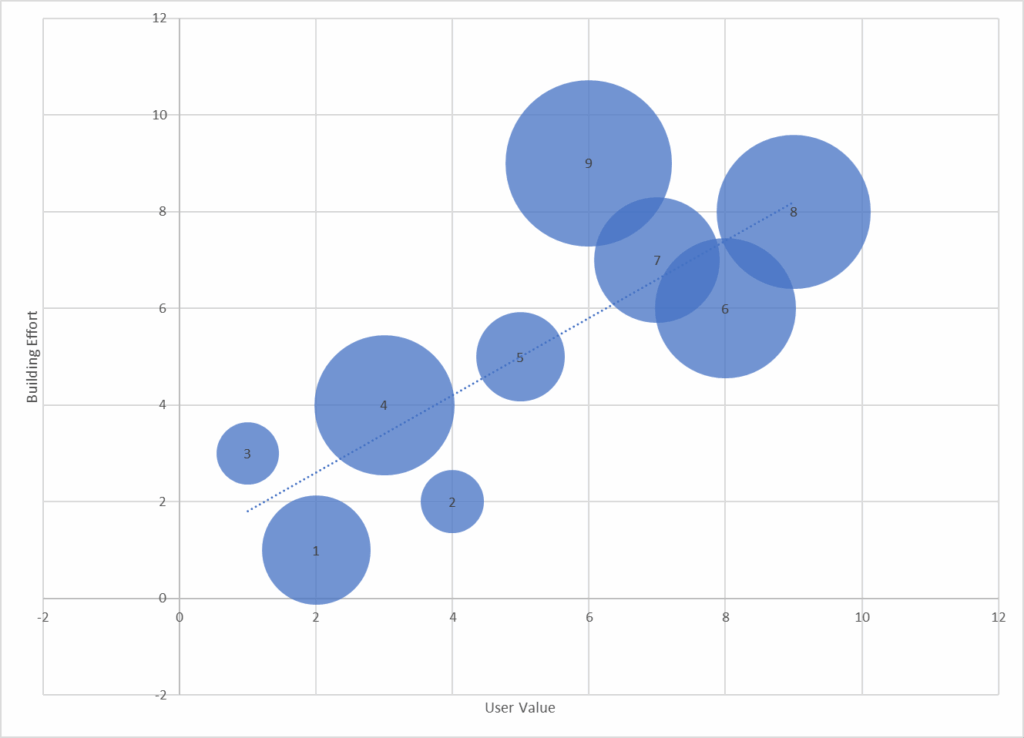
Now while prioritising, it’s fairly easy to see that staying closer to the X axis (or below the line) and picking the biggest circles can optimise for focused user value led production and trying to stay closer to the Y-axis, while picking the biggest circles optimised for you on a cost to business ratio.
